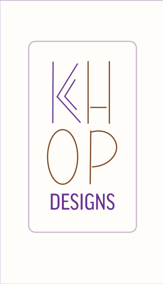
Logo Design
Dous Logo Design
Client: Quataya Clermont
February 2025
Mrs. Clermont needed a logo designed for Dous: her baked goods delivery service.
Her only requests were that the logo be pink, girly, and frilly. So off I went!
Dous proved to be a very fun design to whip up! I chose a delicate font, sweet color combos, and illustrative elements that invoked the food or the delivery aspect of the business.
In the ideation stage, the sketches were all about sweetness- from cookies to frosting to delivery box bows. I also drafted a suggestion of hers: the logo with a chef's hat and a bow. In the end, my client settled on the stamp as her primary logo, making this logo a distinct, yet still girly and sweet, ensign for her bakery!
Miscellaneous Logo Designs
Below is an assortment of logos made for academic assignments, a book publishing company, and a children's author. These logos challenged me to expand to different kinds of logos, from wordmarks to emblems.
Publication Design
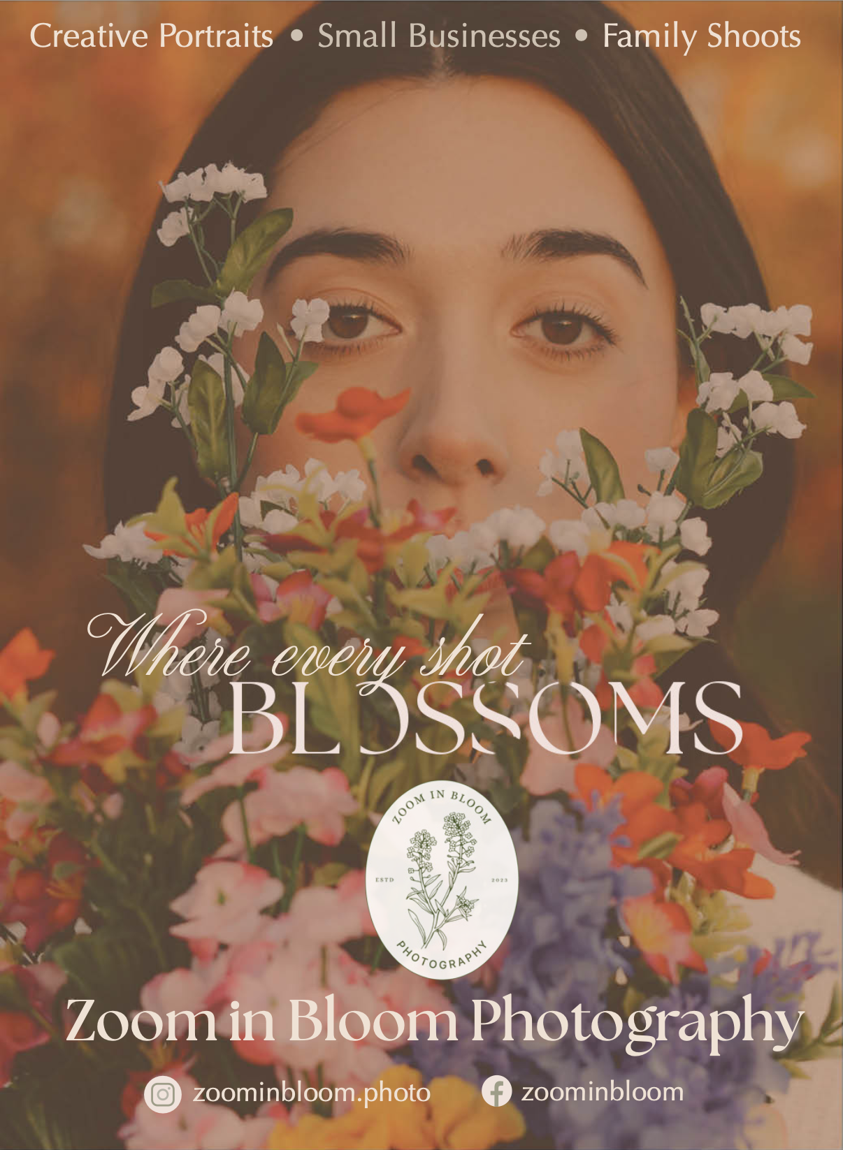
Zoom in Bloom
Ad featured in Enjoy Cherokee Magazine Vol. 13 Issue 1
Enjoy Cherokee Magazine Spreads
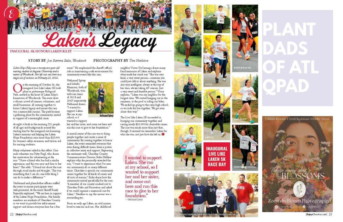
2025K Spread & Laken's Legacy Spread
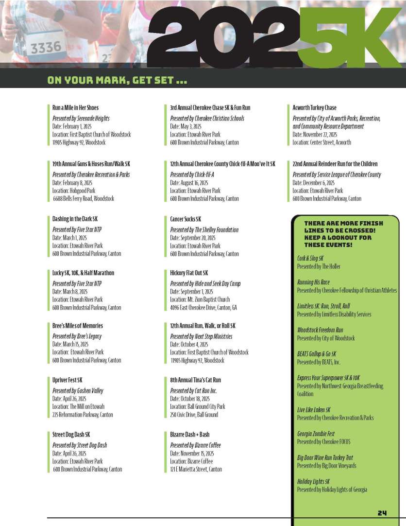
During my internship with Enjoy Cherokee Magazine Inc., I completed two spreads that were featured in their January-February 2025 issue.
The 2025K spread featured information-heavy content that needed to be formatted concisely, but with readability in mind. Due to the monotony of the content, I designed features like the title and supporting elements to be attention-grabbing and bold.
Laken's Legacy is a spread about a 5K ran in Laken Riley's honor. The subject matter was weighty, but hopeful. I designed the spread to be respectful, but also full of life and community-focused, much like the person Laken Riley was. This spread was an honor to work on, and I found myself inspired by the lasting impact of the Laken Riley Foundation.
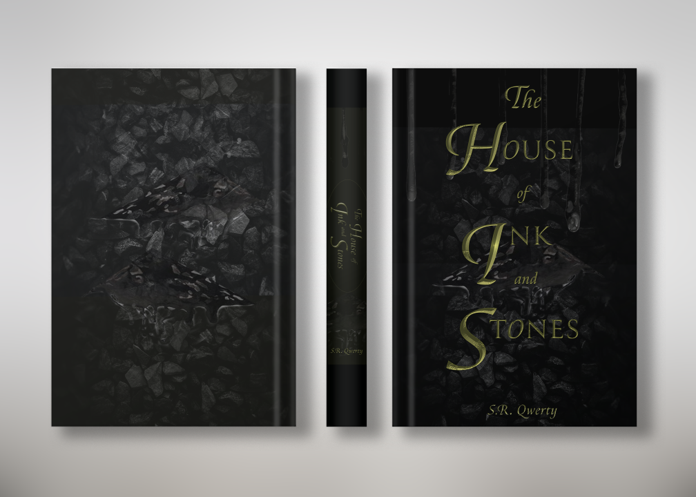
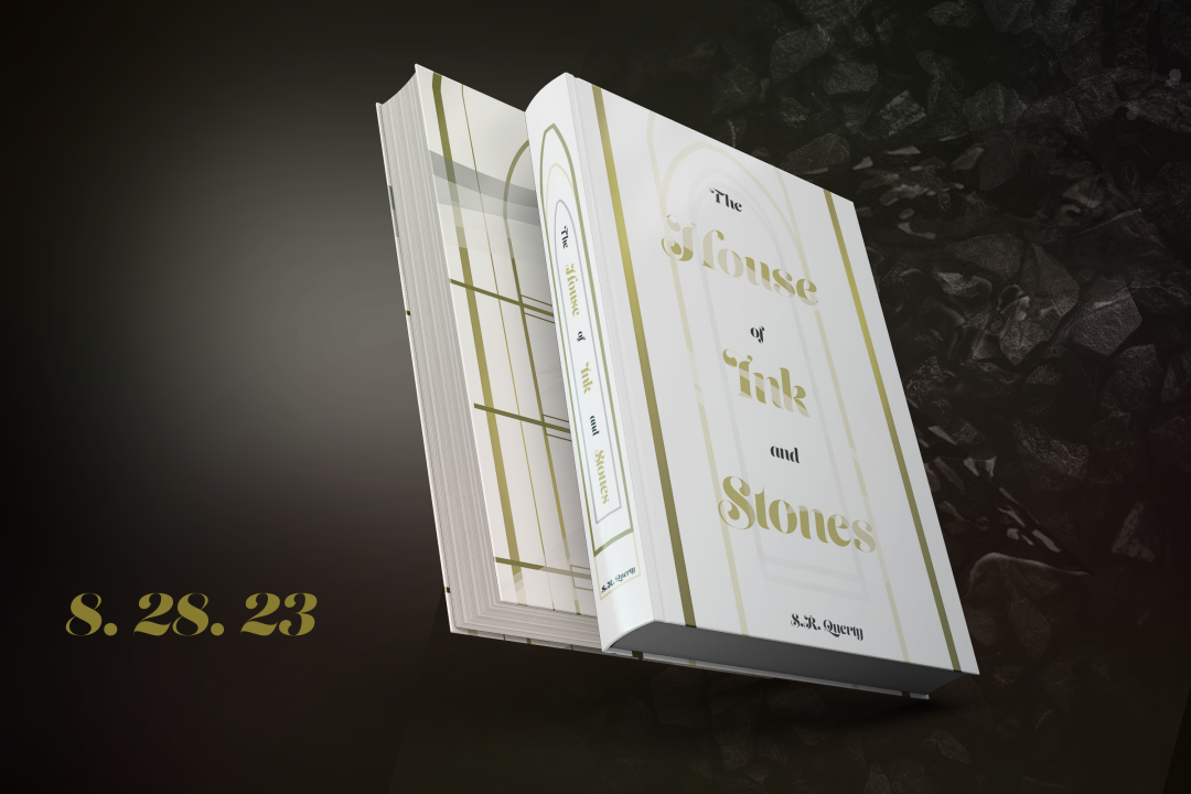
House of Ink and Stones Book Covers
Client: Spellbound Publishing House, LLC.
Spellbound Publishing House requested two different covers for their upcoming book, House of Ink and Stones.
I created one conventional and one unconventional cover. The conventional cover features typical dark fantasy design, such as gold 3D lettering, a dark palette, and a design that compliments the title itself. The unconventional cover features a bright color palette, symmetrical design, and a playful, mist-shrouded typeface. It contrasts with the dark theme of the title, creating intrigue.
Promotional Graphics
Infographic for Zep
Client: Mr. Brian Hindt, on behalf of Zep Inc.
Mr. Hindt was presenting a powerpoint at the Zep Conference 2023, and needed an infographic to convey his idea to his audience.
His particular commission was dense with information. In essence, the issue was that warehouses were not cooling properly because the evaporator coils were dirty, blocking air flow.
Before I could even get started, I had to do my research on
- what an evaporator does, and how to simplify that concept visually
- what an evaporator looks like, inside and out
- how to properly convey a warehouse setting
Mr. Hindt gave me a rudimentary sketch on a napkin for the desired layout, and I brought everything to life from there.
Conveying a close-up look at the inner workings of an evaporator and how it affects air flow across the room proved to be a fulfilling challenge. This project reminded me that design's primary function is to communicate, rather than only serve an aesthetic taste.
This balance of form and function served it's purpose well, as it created an understandable infographic.
Mr. Hindt presented this infographic at the 2023 Zep Conference and said it was well received.


Spellbound Promotional Graphics
Client: Spellbound Publishing House, LLC.
Spellbound Publishing House, LLC. commissioned me to create promotional material. The first project was advertising for their business, the second was a promotional illustration for their upcoming service, AdBlast.
The first promotional graphic was a general advertisement for their business. It featured their motto, "Chance Taking, World Making", and featured the company's colors -black and purple- exclusively.
The AdBlast service would handle all advertisement and marketing for the author who used it. Hence, I chose to do an illustration that was simple, dynamic, and communicated effectively that their client would get bang for their buck.
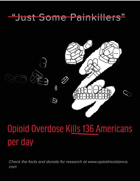
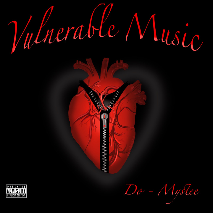
Miscellaneous Promo Material
Below are two miscellaneous projects.
The first is a promotional poster bringing awareness to the opioid epidemic in America.
I chose to use illustrative elements to convey the dangers of trivializing opioids; I used the
pills to create a skull face, but one that is not obvious and in-your-face, much like the danger it
warns against.
The second is an album cover for the artist Do-Mystee. The theme of his album was vulnerability,
and this illustration conveys opening up your heart, like unzipping a jacket.
3D Design
Espresso Machine Animation
I am still an amateur at 3D Design, but this animation was created 100% by me over the course of 2 weeks.
I designed the espresso machine model, the city, and every prop seen. It is rudimentary, but made with love.
Though this work was made in Cinema4D, I have experience in Maya360 and Blender doing simple animations with creative models.
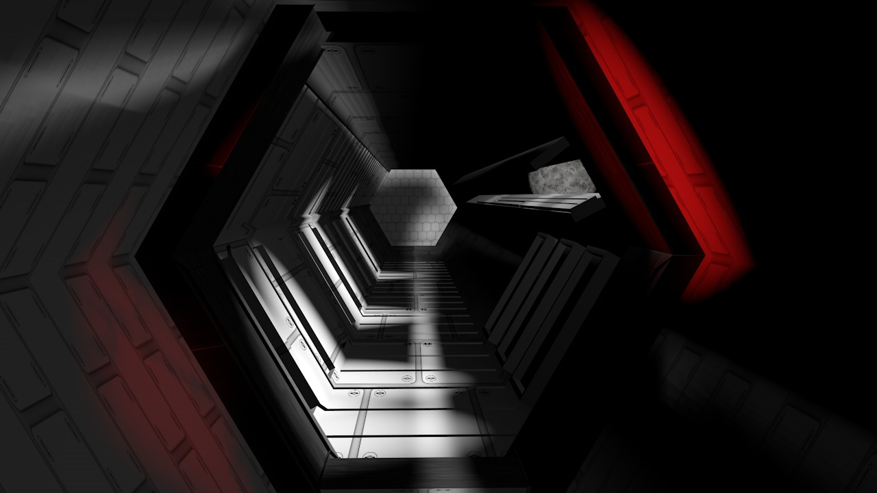
Sci-Fi Scape
This is a sci-fi scene created for fun, but I ended up being pretty proud of it. It is a hexagonal hallway in a futuristic space station, lit by the moon outside and by alarm lights in the foreground.
